How to create the best color palette in web and product design
A guide to pick out the best colors with intention for your next website or product design.
In web and product design, color sets the brand's tone and voice, hierarchy, and user behavior. The strongest color palettes aren’t built from trends or personal taste. They’re built from purpose and restraint.
Start With Purpose: What Color Is Doing, Not What It Looks Like
Before choosing a single swatch, define what the brand or product goals and what it needs to communicate. Color always carries meaning, whether it is trust or urgency, calm or momentum, or clarity or expression.
But meaning is contextual. A color that works in branding can fail in product. A bold palette that shines on a marketing site can collapse inside a dense interface.
That’s why color decisions shouldn’t start with preference. They should start with intent:
What actions matter most?
Where should attention go?
What should feel quiet? What should stand out?
When color is chosen with purpose, it stops being subjective and starts being strategic.
Few Colors Mean More Impact: The 60–30–10 Guide
Restraint is what makes color hold more intention and meaning. The 60–30–10 guide is a simple framework for building balance, hierarchy, and readability without making the designs too complicated.
60% — Dominant color
The dominant color is the most used in the UI design. It is not always the brand color as it may cause accessibility issues. It works best if it’s a neutral color, such as white, black, grays, browns, or beiges. These would be used in large areas, such as backgrounds.
30% — Secondary color
The secondary color is used to add contrast and depends on the design's mood and goal. It captures attention, such as text headers, cards, and banners. If there are already existing brand guidelines, the secondary color can be the brand's main color or accent color. To create more excitement and contrast, the secondary color can be complimentary from the dominant color, which is opposite from it in the color wheel. To be more harmonious, it can also be a color that is analogous, which are next to each other on the color wheel.
10% — Accent color
This is the pop of color that contrasts the most against the dominant and secondary color. It can be complimentary from the dominant or secondary color in the color wheel. Accent colors capture immediate attention, such as in buttons, notification bubbles, badges, flags, icons and more.
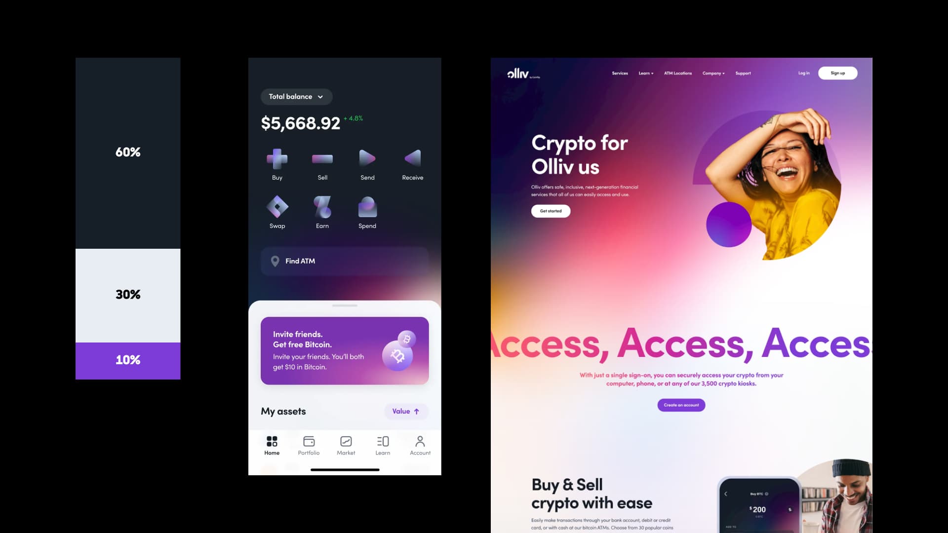
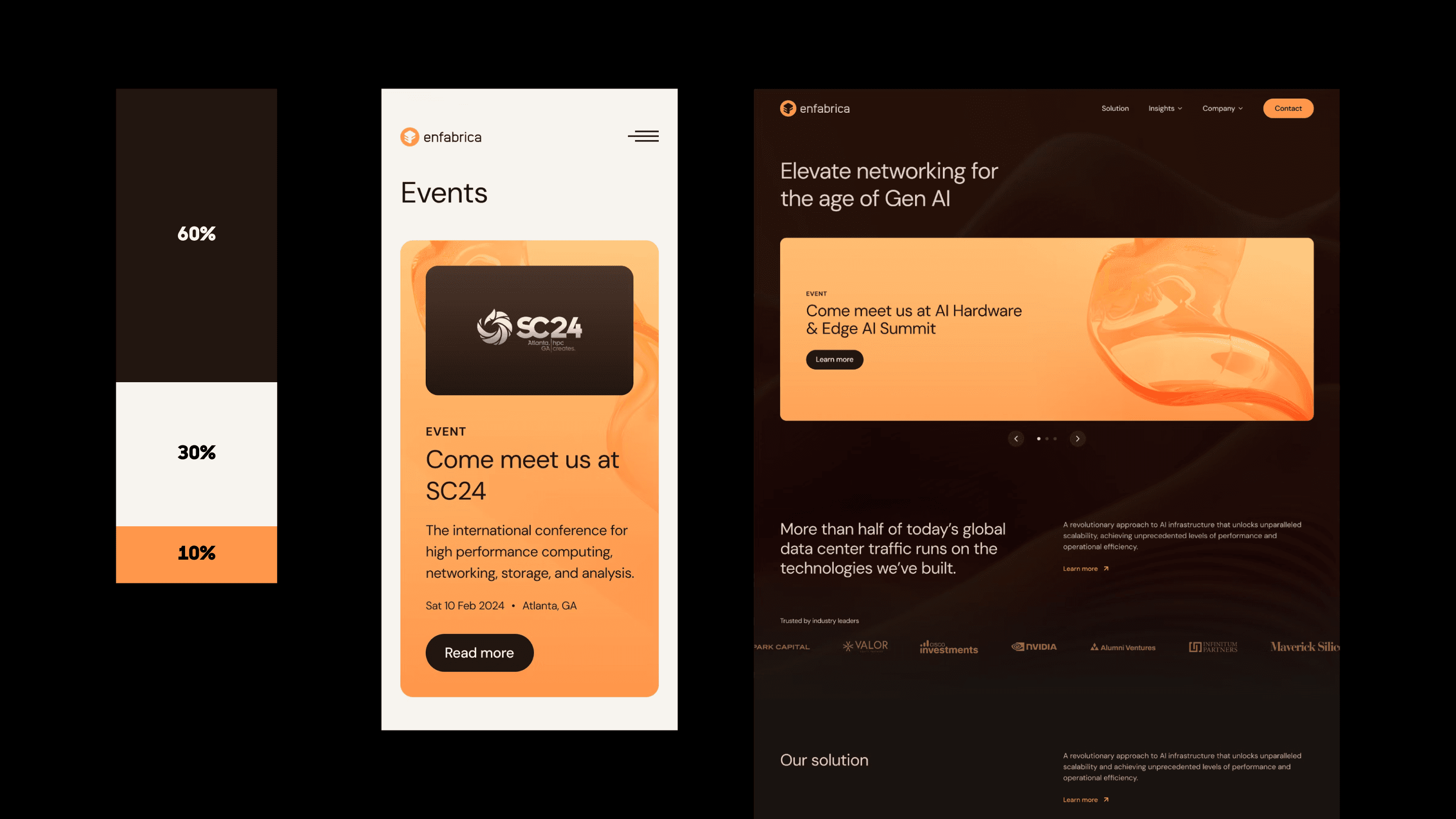
Using the 60-30-10 Guideline
This guideline is just a starting point to help you test out color palettes, but keeps your website and product designs clean, professional, and usable. This guideline may not always be followed, such as staying monochromatic and only having a dominant and secondary color.
Try mixing up various color combinations and ratios to see which feels the best. ANML oftentimes uses the 60-30-10 guideline for colors, keeping our designs fresh and user-friendly.
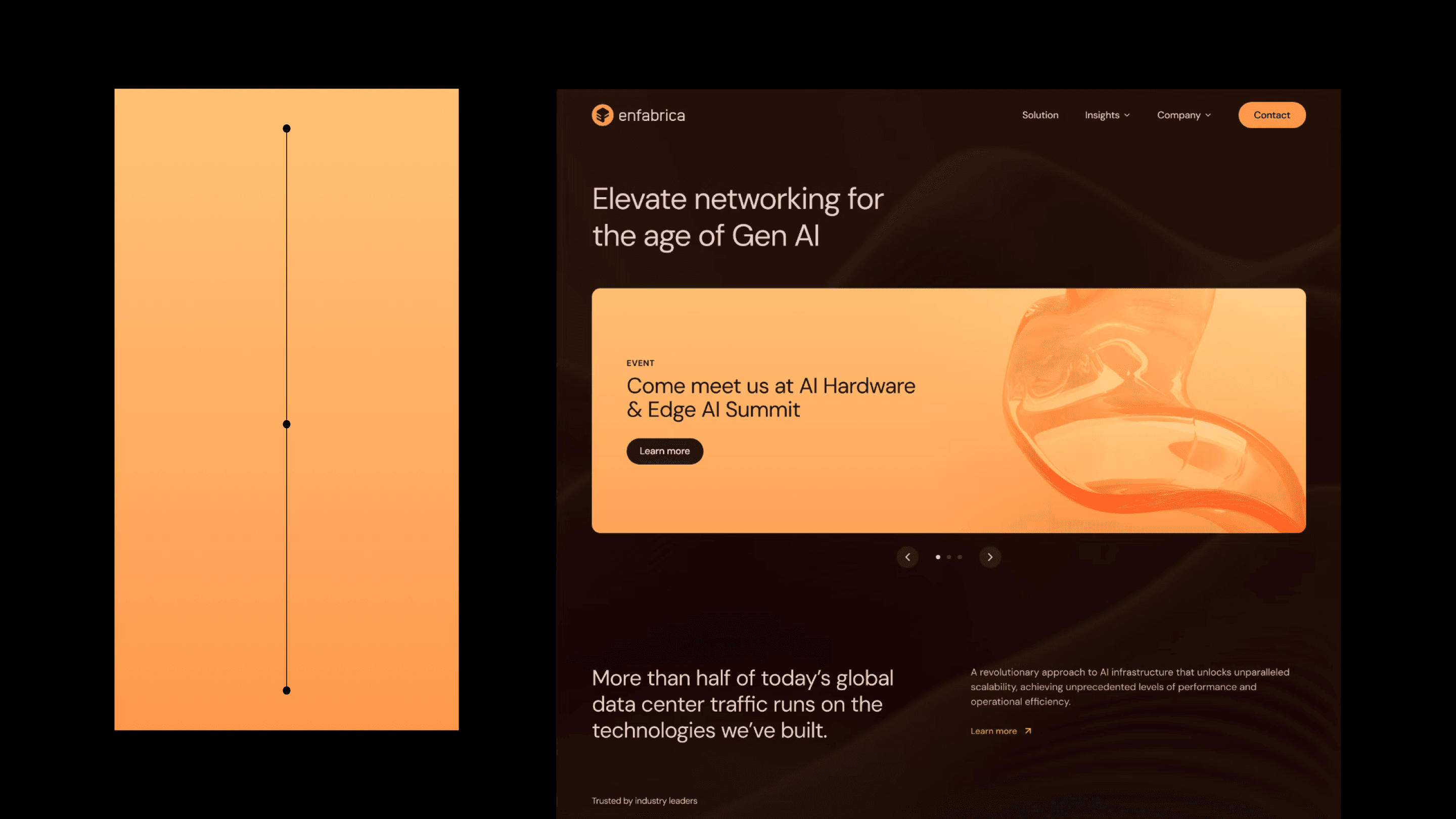
60-30-10 color palette for Olliv and Enfabrica website by ANML:
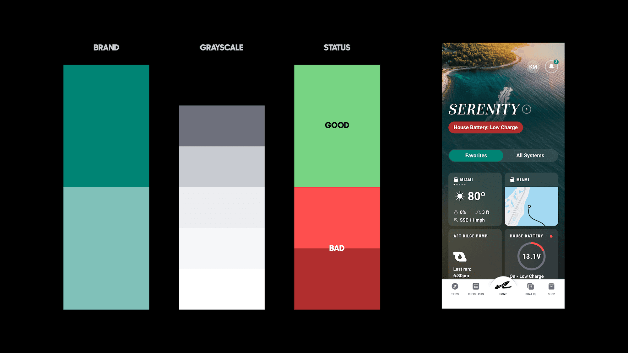
Additional Colors: Tints, Shades, and Semantic Colors
Tints and Shades
Sometimes, a bit more variety of colors is needed to boost clear hierarchy. If a palette feels messy, it’s usually because there are too many clashing colors trying to do the same job.
Instead of adding new hues:
Extend existing colors with tints and shades
Adjust saturation and brightness
Use opacity for states and depth
The goal isn’t variety, but coherence. A limited palette with depth will always outperform a large palette without structure.
Semantic Colors
Semantic colors are functional with clear meaning. They may need to be added, especially for an app that has different tags, notifications, warnings, and alerts.
Semantic colors may portray:
Green for success
Orange for warning
Red for error
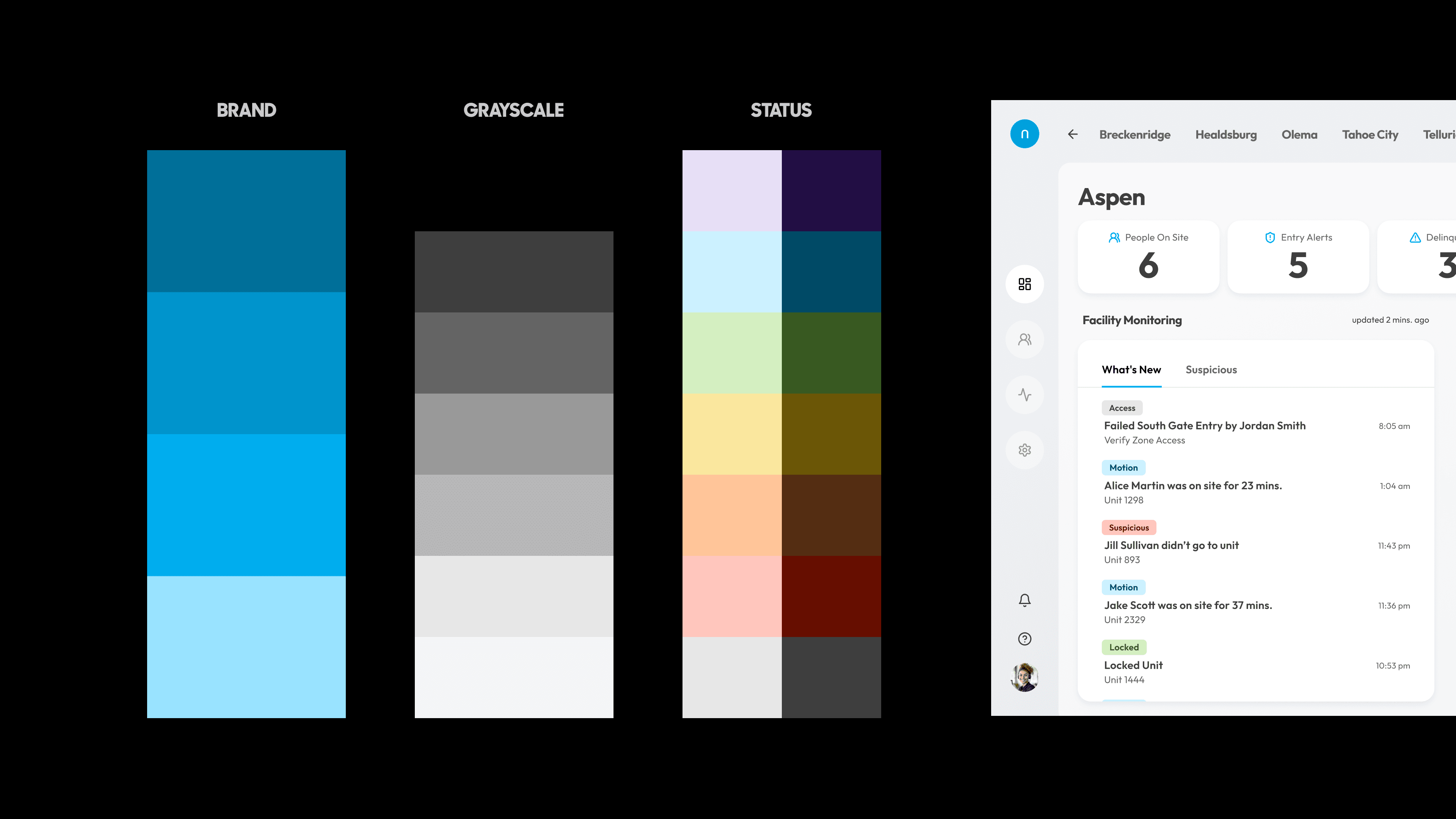
These colors should be familiar, not reinvented. When color roles are clear, usability become easier, such as in Brunswick’s app design that use good and bad status colors to track boat health.
Tints, Shades, & Semantic Colors for Brunswick app by ANML:
Multiple colors may need to be created to represent several items, such for Noke’s tags representing actions made in storage facilities. With using a lot of colors, they need to be handled with care to not make the design too busy. It’s best to use those multiple colors minimally in small portions.
Tints, Shades, & Semantic Colors for Noke Portal by ANML:
Gradients to create depth and emotion
When to use gradients
To make designs more interesting, gradients can be used to create more depth and brand expression. They can be subtle as a background accent, or capture attention in a button or card. Before adding a gradient, define what it’s doing.
Gradients are most effective when they:
Create visual hierarchy
Add visual depth
Highlight primary actions
Support the brand’s goal, tone and voice
If the gradient doesn’t have a job, it’s noise without a purpose.
How to create the best gradients
Gradients don’t need to use new colors, but they can extend the palette you already have.
Create gradients from:
Tints or shades of the primary, secondary, or accent colors.
The lightness and saturation of the colors
Gradients should feel like an extension of the brand’s existing colors, not a separate visual layer.
Create subtle shifts in gradients
It’s best to use minimal shifts in the gradients, from one color harmoniously shifting to the other. Subtle-shifting gradients makes it easier to take in the content and keeps transitions smooth
Create harmonious gradients by:
Using small shifts in changing color
Avoiding extreme light-to-dark jumps
Avoiding shifting complimentary colors
If a gradient becomes too distracting, it’s best to avoid it.
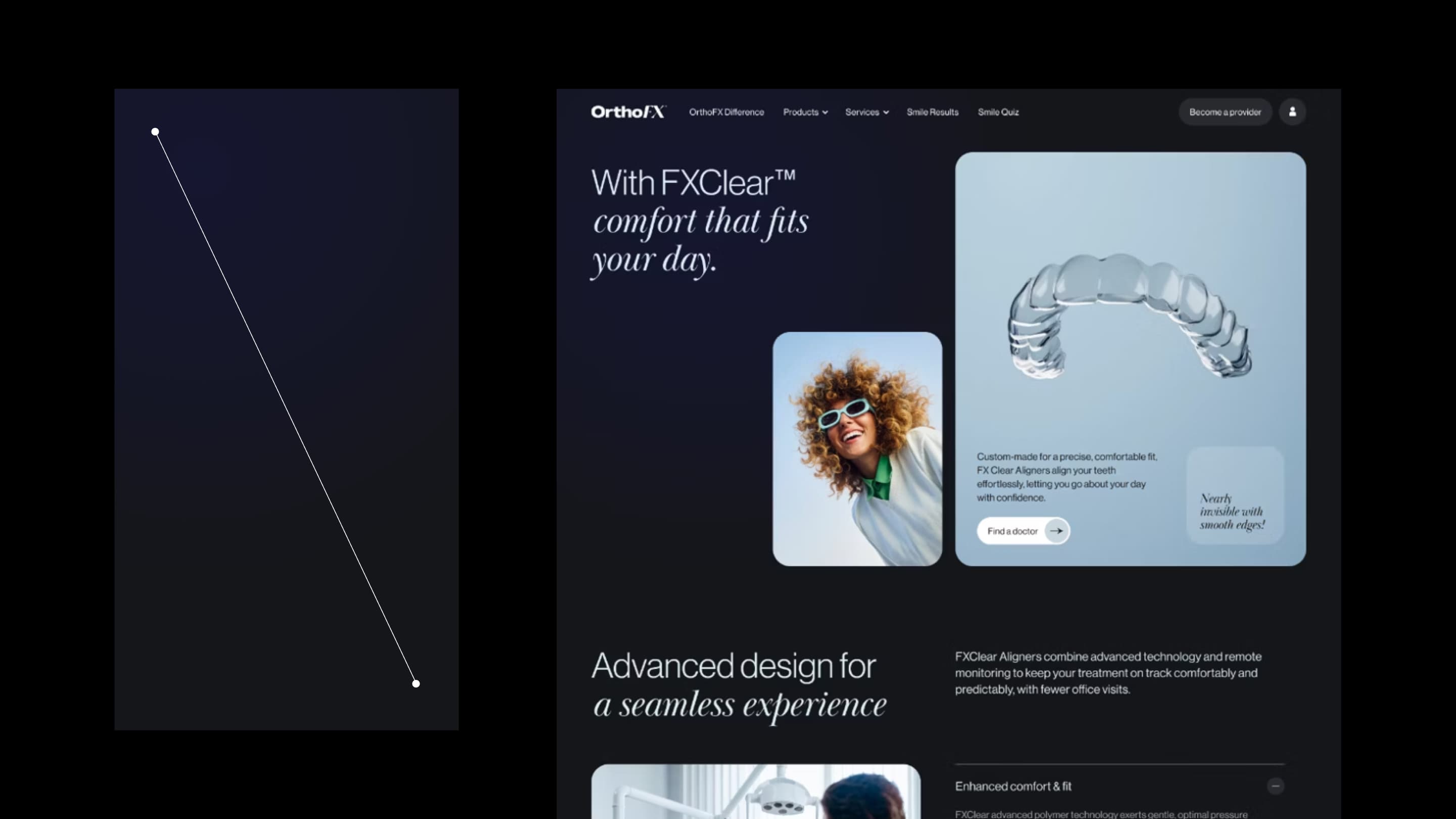
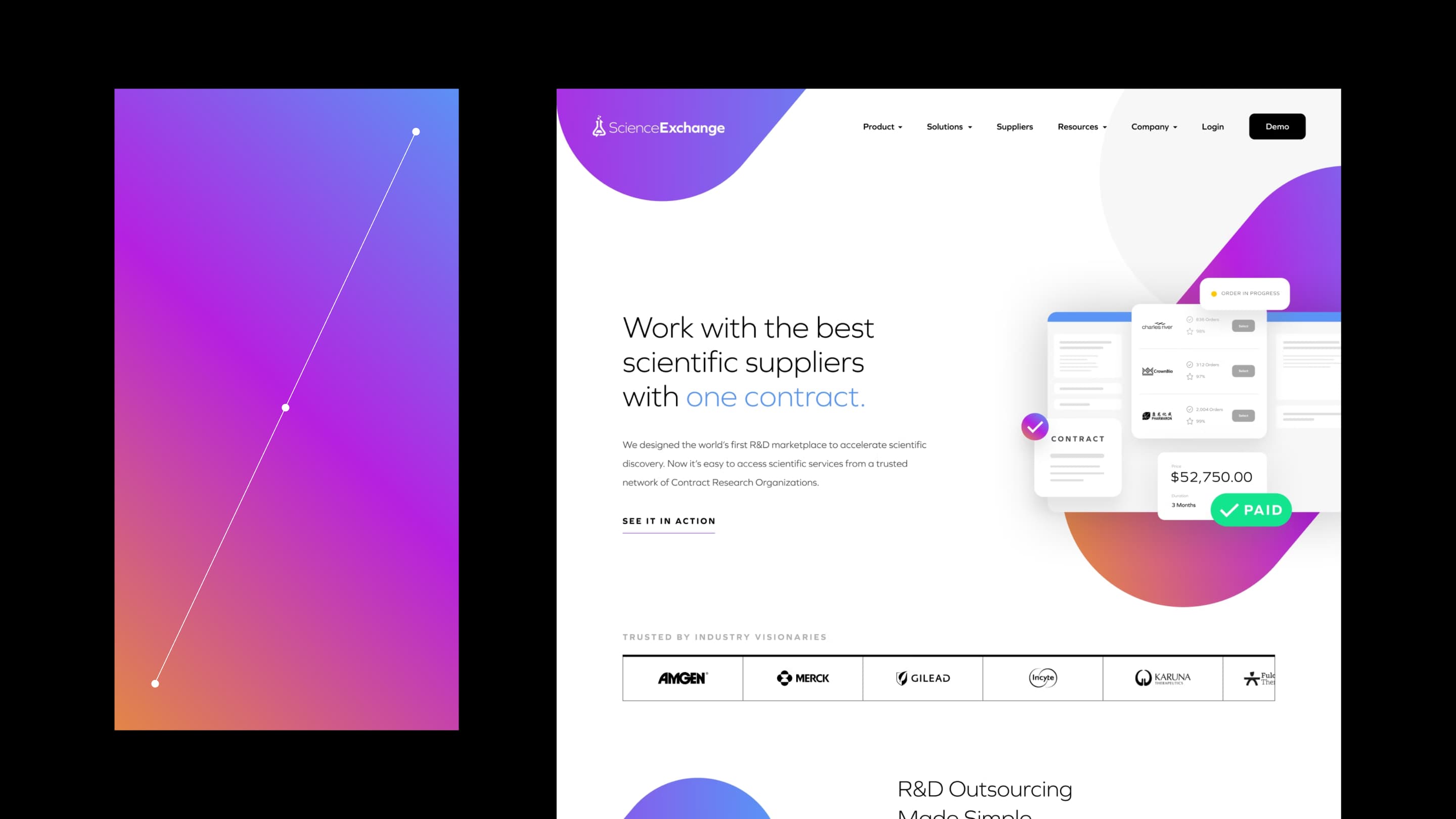
For Enfabrica, ANML used their brand color as part of their signature gradient, but added slight shades to keep it subtle. The gradient made their banners capture attention and energy. OrthoFX used a dark, subtle radial gradient for the background, creating a luxurious experience to present their aligners. Science Exchange used vibrant colors
Gradients for Enfabrica, OrthoFX, and Science Exchange Website by ANML:
When creating an effective color palette, remember to build it with intention. Every choice should serve brand expression, clear hierarchy, and easy usability. Always consider color with consistency and confidence.
FAQ
Why is color important in web and product design?
Color sets a brand’s tone, establishes visual hierarchy, and influences how users behave and interact with a product.
What is the 60–30–10 color rule and do I always have to follow it?
The 60–30–10 rule is a guideline for balancing color in design using a dominant color (60%), secondary color (30%), and accent color (10%). But the rule is a starting point. Some designs work well with monochromatic palettes or different color ratios.
How do tints and shades improve a color palette?
Tints and shades add depth and hierarchy without introducing new colors, keeping the palette cohesive and structured.
Why should designers avoid adding too many colors?
Too many colors can make a design feel cluttered and confusing, while a limited palette with depth improves clarity and usability.
Why are semantic colors important?
Semantic colors help users quickly understand system states and feedback, improving usability and reducing confusion. Semantic colors should be familiar to users so their meaning is instantly understood, such as red for error.
When are multiple colors needed in a product?
Multiple colors may be needed to define tags, statuses, or categories, but they should be used minimally to avoid visual overload.
When should gradients be used in design?
Gradients should be used to add hierarchy, depth, emphasis, or brand expression. If a gradient doesn’t serve a clear purpose or becomes distracting, it’s better to avoid using it.
About Anml

Related posts
Create faster wireframes with these AI tools
Learn how to speed up wireframing with these top tools in the design industry.
Design system vs. component library vs. pattern library: what’s the difference?
Clear up the confusion between design systems, component libraries, and pattern libraries. Learn what each includes, how they work together, and which one your team needs to scale consistent, high-quality products.
Motion that converts: how interface animation drives action
See how purposeful interface motion boosts conversion—with real-world stats—and learn where to use microinteractions and animations to reduce friction and drive action.